Helping people find what to watch faster and with ease
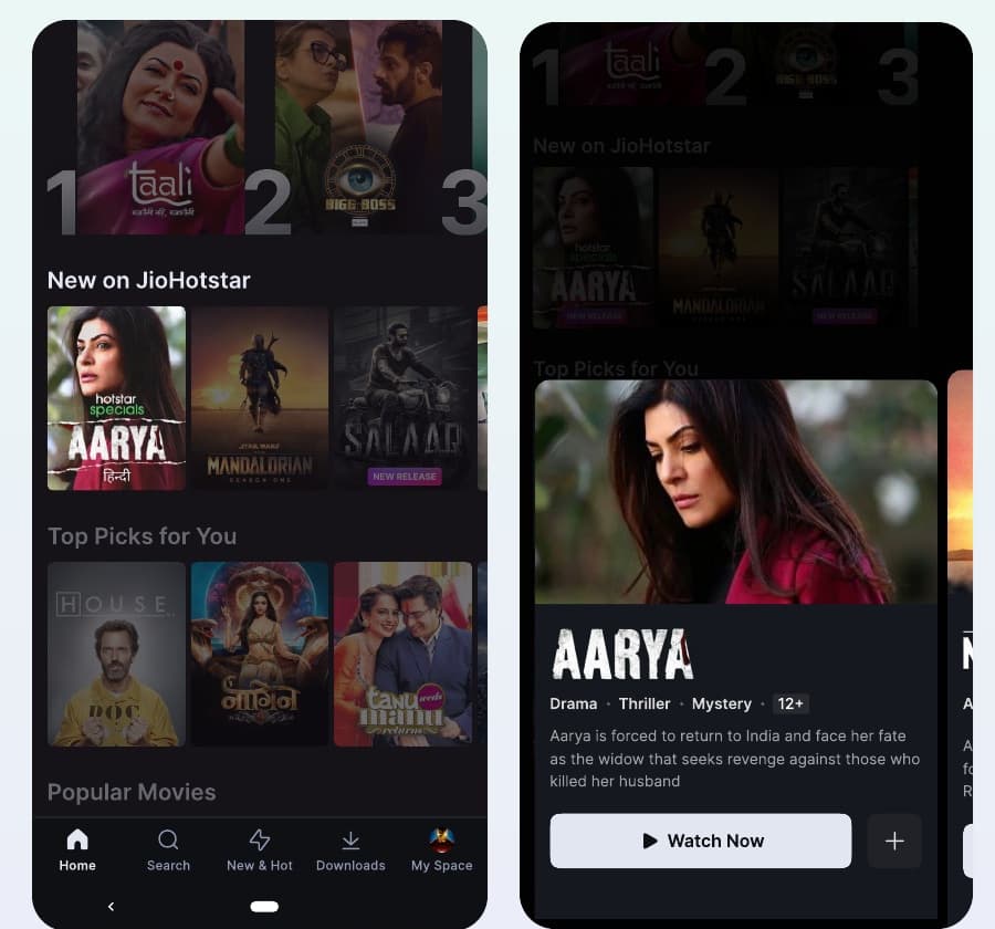
How a half-window sheet helped Disney+ Hotstar users get from browsing to watching.
The Product
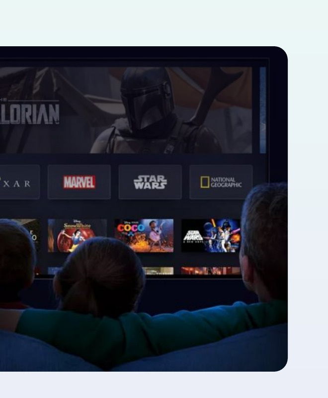
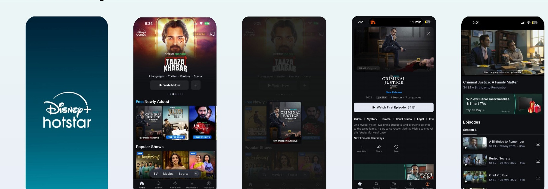
Disney+ Hotstar is India's leading streaming platform, with over 300 million monthly users and a presence in 23 other countries across SEA and MEA.
At that scale, even a small drop at any point between opening the app and pressing play means millions of people who never reach the moment they came for: the magic moment of watching something.
Where People Were Dropping Off
I started by tracing the content discovery funnel, from the moment someone opens the app to the moment they start watching.
- Splash: 100%
- Home: 90%
- Tap on content: 74%
- Details: 73%
- Watch: 55%
Almost half of the people who opened the app never started watching anything. The biggest gap wasn't at a single step. It was spread across the journey from the homepage to the decision to watch.
What the Data Told Us
Two patterns stood out on the homepage.
First, when users landed on the homepage, they were greeted with an organised wall of content, and only 30% made it beyond the first three trays.
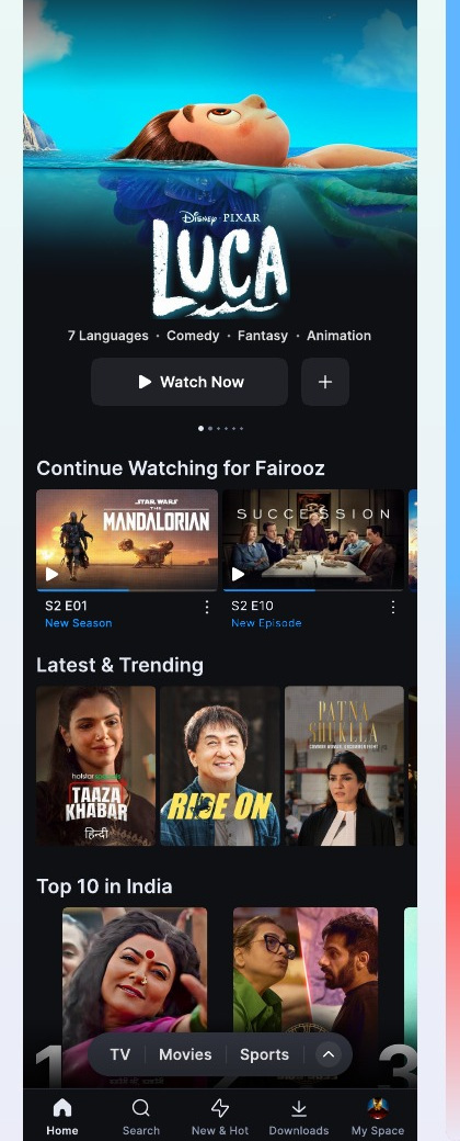
Second, within each tray, click-through rate dropped sharply after the first three titles, the ones visible upfront. The first three tiles pulled 20%, 17% and 15% CTR. The fourth and fifth fell to 6% and 5%.
The wider engagement picture pointed the same way:
- 60% monthly app open rate: over 60% of users opened the app only once a month.
- 45% bounce rate: over 45% of users left the app without watching any content.
- 16% drop-off on the homepage: 16% of users left without tapping on any content from the homepage itself.
That gave me the goal for the project: how can we help people get to the magic moment quickly and with ease?
How Do People Pick What to Watch?
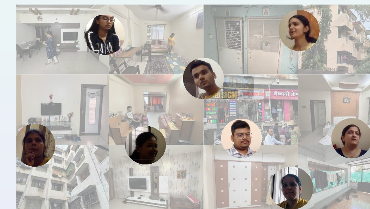
The data told us people were leaving. It didn't tell us why. So I ran research sessions with our researchers to understand how people actually choose what to watch.
What came out of those sessions was a pattern in how people naturally decide, which became the framework for the rest of the project.
The Framework: Diverge, Converge, Decide
Diverge: "What's out there?"
People start by glancing across content. They need easy movement and breadth.
Converge: "These ones look interesting!"
Next, they shortlist. They need hooks to shortlist and the ability to make quick decisions.
Decide: "Which one should I watch?"
Finally, they compare their shortlist. They need details and easy comparison.
This framework wasn't something I brought into the project. It's what the research showed about how users actually behave, and it shaped every design decision that followed.
Insight 01: Tapping Felt Like a Commitment
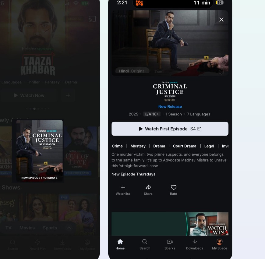
On the existing homepage, tapping a title took you to a full details page. Users told us that tapping felt like a commitment. They wanted to sample content, not navigate to it.
Insight 02: Every Title Was a Round Trip
One user described it simply: it was time-consuming to open a trailer, go back home, repeat, and only then decide what to watch.
Putting information on the details page made the homepage cleaner, but it pushed the cost of comparison onto the user. Every title they considered required a round trip: homepage, details page, back to homepage, another details page, and so on until they finally settled on something. This was the Decide stage of the framework, and the product was making it expensive.
Exploration 01: Depth in the Homepage
My first hypothesis was that reducing choice would help users commit faster. I tried a focused homepage feed that gave each title more depth, with video, metadata and a description, instead of rows of trays.
It did the opposite. Users wanted breadth to glance across, not depth on a single title. Visitor-to-viewer conversion dropped by 2.5%.
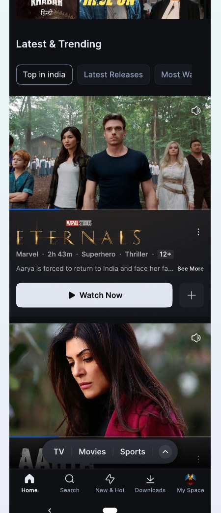
One piece of user feedback captured the tension: the description should be inside, and the homepage should have a lot of content.
The learning: users need to see the catalogue to feel confident in their choice. Narrowing the view didn't reduce friction. Instead, it removed the browsing behaviour that leads to commitment. In framework terms, I had given people a Decide experience while they were still in the Diverge stage.
Exploration 02: Stories
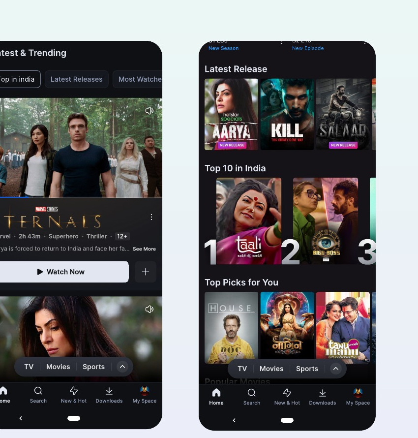
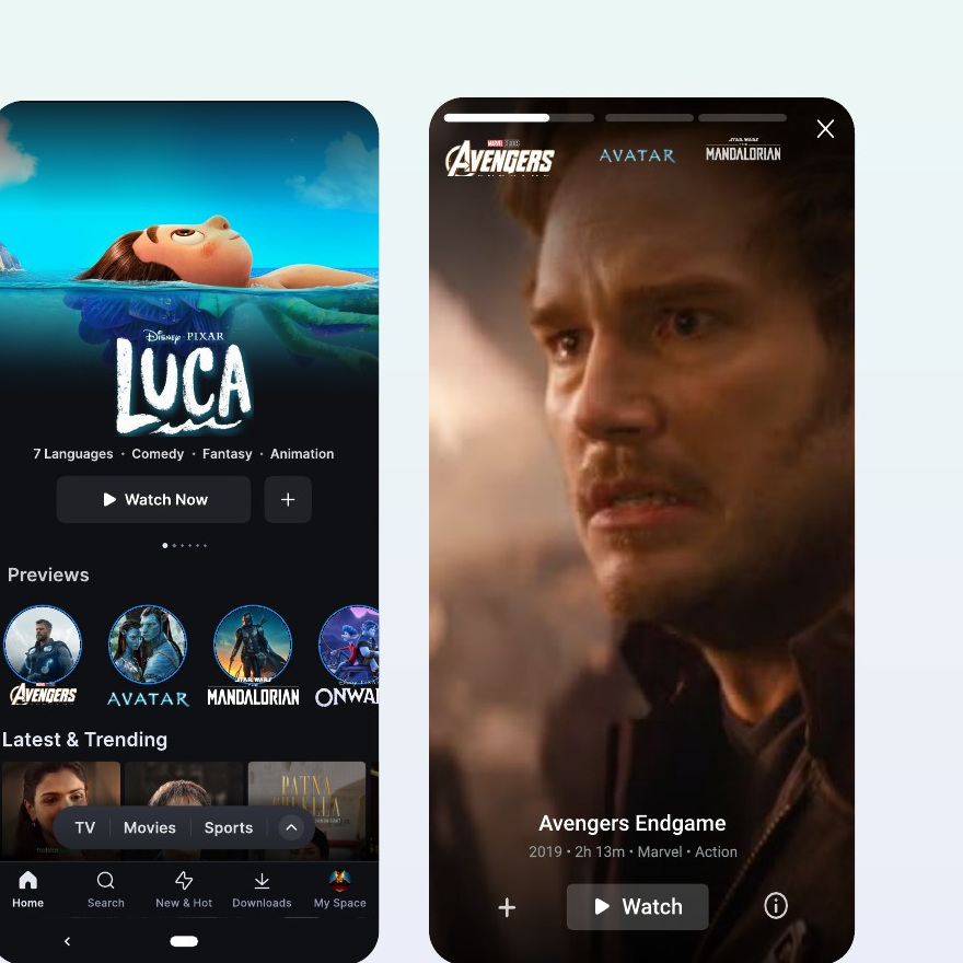
Next, I explored an immersive, fullscreen mode for sampling trailers back to back, borrowing the stories pattern from social apps. A Previews tray on the homepage opened into fullscreen trailers users could tap through.
The format was too interruptive. Users had to leave the homepage entirely, which broke the comparison behaviour we'd observed in research. It reached a click-through rate of just 0.8%.
Exploration 03: The Browse Sheet
The two failures made the requirements clear. The homepage needed to keep its breadth, and sampling needed to happen without leaving it.
The Browse Sheet is a swipeable sheet for sampling trailers while staying on the homepage. It was built around two principles.
Just enough information to decide. Research showed that people preferred a combination of trailer and description to make a decision, so the sheet gives them exactly that and nothing more.
Nudge people towards action. The sheet offers only two clear actions: watch now, or add to the watchlist to watch later. That helps people be more decisive.
The Final Direction
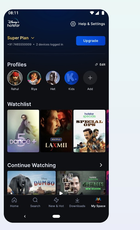
The half-window sheet let users peek without leaving. Moving back and forth between the homepage and a title's details became frictionless, because the homepage never disappeared.
It supported all three stages of the framework in one place: the homepage kept its breadth for diverging, the sheet let people converge by sampling quickly, and swiping between titles made comparison easy when it was time to decide.
Impact: More Sampling Led to More Committing
- +23% trailers sampled
- +25% watchlist usage
Making trailers easy to sample meant more people added content to their watchlist to watch later.
- +22% watchlist watchtime
- +1.7% platform watchtime
More shortlisted content meant people started watching more from their watchlist. The Browse Sheet didn't just help people decide in the moment. It built a shortlist they came back to.
A Scalable Pattern
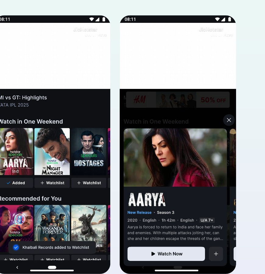
The Browse Sheet started as a homepage problem. But the same tension exists everywhere content competes for attention, for example when a live cricket match ends.
At the end of an IPL match, the player surfaces trays like "Watch in One Weekend" and "Recommended for You." The same half-window sheet works there, letting someone sample a show without abandoning the match screen.
The pattern works on the homepage and inside live sport because the core behaviour it solves for doesn't change: letting someone sample without committing.
What I Learned About Discovery
Match the experience to the user's mindset. Diverging needs breadth. Converging needs hooks.
Visual hooks matter more than text. In the Diverge phase, images beat descriptions.
Reduce friction at every step. Make exploration feel effortless.
Test, learn, iterate. Your intuition is a hypothesis until it's tested. My first two ideas failed, and each failure told me exactly what the final design needed to do.